A great logo makes your job of selling easier.
Your logo is the embodiment of your brand and company image. It’s often the first impression your business will make.
Clients expect a credible business to be represented by a professional logo. If your logo looks cheap, they’ll think your company is cheap too.
But while most business owners recognize the value of a great logo, they don’t always prioritize it.
Some incorrectly assume it will cost thousands of dollars to create one. So they look for free or cheap pre-made logos online. Or they slap an icon alongside their company name and call it a day.
But saving money on a logo might be costing you more in lost sales.
Here are five of the world’s most recognizable logos and lessons you can learn when developing one for your business.
Nike:
![]()
Famously, the designer of the Nike Swoosh was paid $35 for her efforts. Carolyn Davidson created it for Nike owner, Phil Knight. He wanted a logo that was simple and fluid, that conveyed motion and speed.
His first reaction after seeing the now famous swoosh: “I don’t love it, but I think it will grow on me.”
- Lesson: A great logo might not be evident at first. Don’t dismiss a design based on your first impression. Consider how it fulfills the brief. Logos don’t always cost huge sums of money either.
FedEx:
![]()
Designed by Landor Associates in 1994, the FedEx logo looks very simple. It’s a typeface logo with five letters, written in Futura in two colors.
But beneath the simplicity hides its secret in full sight.
Between the “E” and “x” is an arrow pointing to the right. That hidden arrow creates movement which is perfect for fast delivery service.
It gives people an aha moment. It doesn’t matter if someone sees the arrow at first or if their friend shows it to them. Either way, there’s a special moment of delight once it’s revealed.
- Lesson: Explore negative space between letters or shapes. Give people a moment of surprise when they discover something clever and hidden within your logo. They’ll remember that moment and your business too.
Apple:
![]()
One of the most recognizable logos in the world is for a computer company.
There’s nothing in this shape that tells us what Apple does. It’s simply an apple with a bite taken out of it.
People have pondered why the designer added a bite.
Some say it references the Bible’s Adam and Eve story. Others say it’s a pun on the computer term “byte”.
The real reason, as told by its designer, Rob Janoff, is that without the bite, the apple logo looked like a cherry when it was reduced in size. The bite gave the logo its distinctive apple shape at every size.
- Lesson: Your logo doesn’t need to explain what you sell. As Paul Rand famously said, “The only mandate in logo design is that they are distinctive, memorable, and clear.”
Adidas:
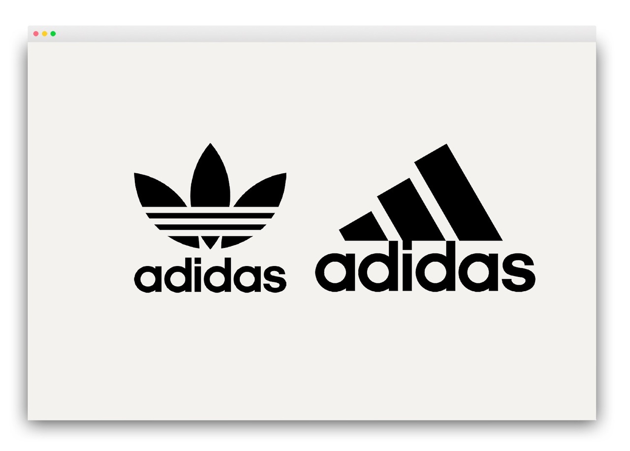
The Adidas stripes started back in the 1920s when founder, Adolf ‘Adi’ Dassler began making shoes with his brother Rudolph in Germany. Their first running spikes featured two stripes along the side to give the shoe structure and stability.
The brothers split after a massive argument. Adi went on to start Adidas, and Rudolf started Puma. Neither brother could use their already recognizable two stripes.
Adi wanted to add a third stripe to his shoes, but a Finnish brand, Karhu, already owned the trademark for the three stripes. In 1952, Adi negotiated to purchase the trademark for two bottles of whiskey and €1,600.
The three stripes were later incorporated into the Adidas logo, known as the Trefoil, in 1971.
In 1990, Adidas created a new logo. Here the three Adidas stripes form the shape of a mountain, symbolizing the challenges faced by athletes. Both logos continue to be used concurrently.
- Lesson: Incorporating a strong and consistent theme into your logo gives you the freedom to update it and even use multiple versions without losing your identity.
Amazon:
![]()
The current Amazon logo has been in use for over 20 years. When it was released in 2000, it was Jeff Bezos’ seventh logo redesign in five years.
My 10-year-old son walked in as I’m writing this, took one look at my screen, and asked, “Do you know what that means?”
He delighted in explaining how “the arrow goes from A to Z because you can buy everything from Amazon!”
You can’t ask any more than that from your logo.
The simple curved line in the shape of a smile is a nice touch. It gives you a warm, happy feeling (perhaps subliminally). It’s the same feeling you get when your package arrives.
- Lesson: Logos don’t need to be complex. There’s beauty in subtle shapes. Keep editing your logo until you find one that works.